Blue Spot in China
![]()
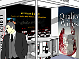
Talk to China, it’s easy if you know how.
How do you increase your margins in an extremely competitive arena, a space where even the majors struggle to turn a dime?
In NWTs case they decided to create a brand to differentiate themselves from all the other tool importer and wholesalers they competed with. This brand was to enable them to ask a premium for an exclusively packaged line of products available only from themselves.
It’s important to understand
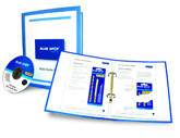
When asked to pitch we jumped at the chance, the brief included creating sample packaging and a “style-guide” that would enable Chinese manufacturers to follow a set design language for all subsequent packaging from drill bits to power generators.
In order to fulfil the brief we decided it was important to understand the market and quickly went out and bought a varied selection of competitors products, (any excuse for a bloke to buy tools and gadgets!). After examining products and, in conjunction with the client, producing a critique of the competitors we narrowed down the options and further defined the brief.
 The next stage, producing proposals, was completed in record time and presented to the client. They listened to what we had to say and then we listened to what they had to say. After a few minor revisions the proposals were accepted and we cracked on with an in-depth design bible for the Chinese producers.
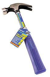 While preparing the guide we learnt that there are an astonishing number of areas where a third-party producer could go wrong and advised our client that perhaps even more detail would be required – after all this guide would potentially cover the packaging of thousands of products – all different sizes, shapes and purposes. We had to make sure it was right, not making it too prescriptive and yet still embodying the design language we so carefully prepared.
The proof is in the pudding.
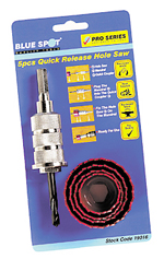
 The first containers of product arrived soon after we completed the guide. Nothaving seen a finished product (other than our mock-ups), we were pleased to see that the Chinese producers had followed our branding guidelines to the letter – no mistakes, no funny phrases and all the correct colours.
The branding and packaging has proved to be a success, enabling our client to expand and become more profitable in the process.